June to July 2026 (4 weeks)
Web App + Chrome Extension
Digital Wellbeing
Personal Project
Vibe Coding
I'd sit down to do something specific and an hour would disappear. Not because I was slacking. I just had no idea where the time was going. YouTube, LinkedIn, some random article that led to three more. I wanted to see it. Not be blocked from it, not feel judged by it. Just see where my time was actually going.
Before touching any design tool, I wanted to know if this was just me or something real.
79% of IT professionals in India report eye strain, headaches or dry eyes from screen use. 35.5% spend 8 to 10 hours a day on screens. Globally, daily screen time went from 9 to 11 hours between 2012 and 2019. 16 to 34 year olds topped every category.
So yeah, not just me.

EyeCare: fine for gentle reminders, nothing to actually learn from.
Break Timer: more flexible, but its own users complained about breaks not firing. Kind of a fatal flaw for a break reminder app.
StayFocusd: real usage data, which I liked. But built entirely around restriction. Block this, enforce that. Nothing about it felt like it was on your side.
Across all three, one thing kept coming up. People didn't just want fewer distractions. They wanted to understand themselves. Where does my time actually go? Nothing out there was answering that.

ORIGINAL DESIGN
This wasn't a fresh idea I sat down and coded. I'd worked on Screen Ease before, as a design project. Research, wireframes, mid-fi, high-fi. It was complete.
It just never got built.
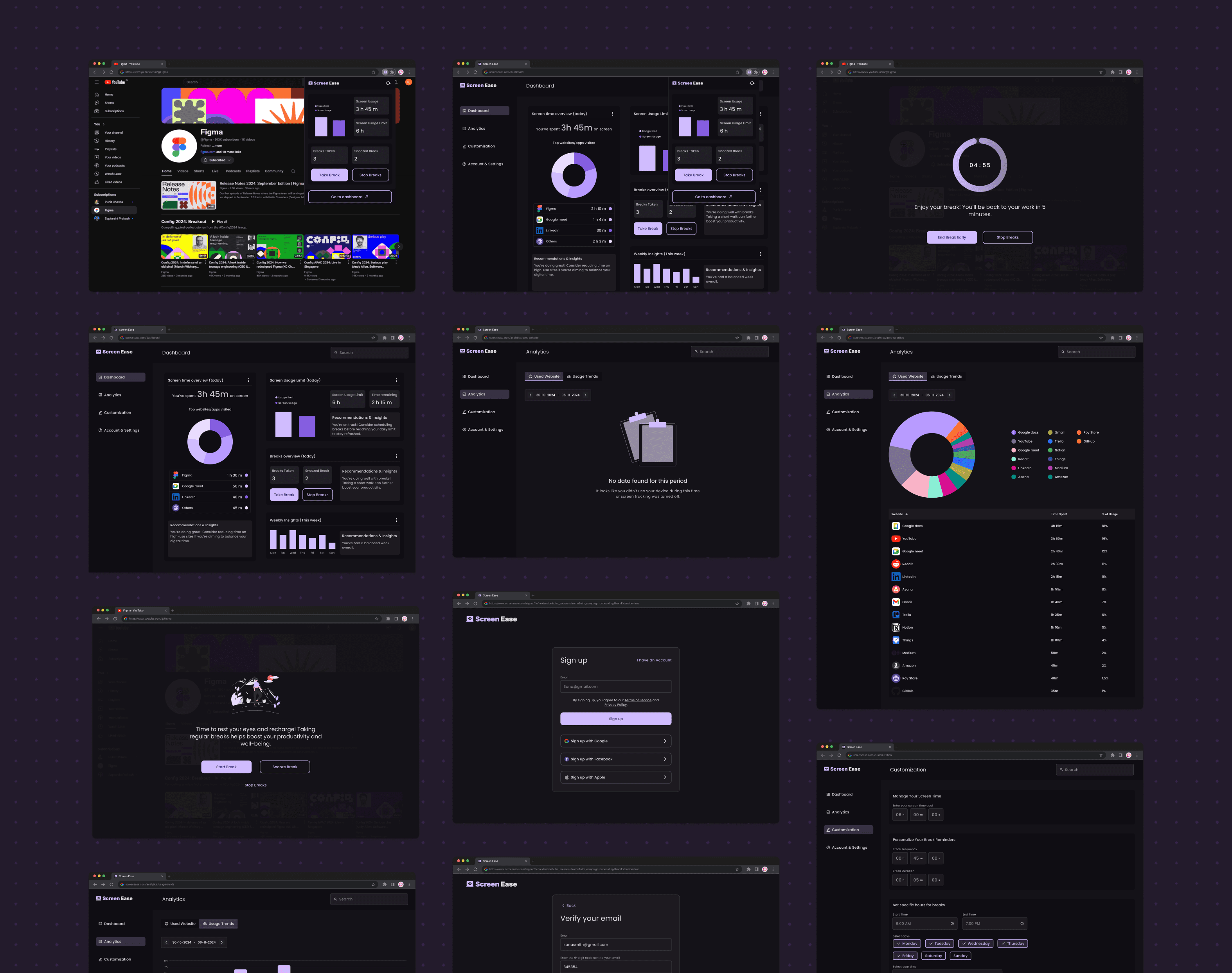
Extension popup, dashboard, analytics, onboarding, break notifications, edge cases. All designed out, sitting in Figma doing nothing.

DESIGN REFRESH
The UI was old. Not bad, just dated. My taste had moved on.
So I refreshed it. UI, branding, visual language. One focused pass, in and out.
I also designed something new. An AI feature called Ease, a way to actually talk to your screen time data instead of staring at a chart. More on that later, it started here, before any code.
Then I designed the website. Quick and simple, just enough to explain the product and get someone to install it.


DEVELOPMENT
I'm a designer who knows frontend. React, basic JS, enough to get into trouble. A Chrome extension with a live backend, real auth, real users, that part was new.
I decided to vibe code it. Not to skip the hard parts, but to find out what I could actually ship on my own.
Stack: React and Vite for the dashboard, Tailwind for styling, Supabase for backend and auth, Vercel for deployment, GitHub throughout.
The hardest part was getting the extension and dashboard to talk to each other. Chrome extensions run in an isolated context. They can't just touch your app's state directly.
I had to work out how postMessage passes data across contexts, how auth tokens travel between the extension popup and the web app, and how to make break reminders fire reliably across every open tab.
I broke things a lot. Fixed them. Broke them again, differently.
Ease runs on Google Gemini. It only sends usage totals, not your actual browsing history. Instead of interpreting a donut chart, you just ask it things. Why was I over my limit today? Which site is eating my mornings? It answers like a person would.


Before submitting anything, I went through the whole flow myself, like a real first-time user would. Fixed the small things I found. Cleaned up a few designs too.
Then the part that's easy to skip. A Privacy Policy explaining what data gets collected and why, Terms of Use, a Help Center with answers to the questions people would actually have. Plus the assets the Chrome Web Store needed, listing graphics, extension screenshots, all of it.
Then I submitted it for review.
Took a few days. I was bracing for a rejection, Screen Ease asks for a fair number of permissions, and that's usually where extensions get flagged. But it went through in one pass. I think it came down to the privacy policy and terms being really clear about why each permission was needed. No back and forth.
Approved. Live.
First Chrome extension I've ever built and shipped to actual live users. That hit different than finishing a design file.
Install it here: Chrome Web Store link
Dashboard: screen-ease.vercel.app
Website: screen-ease-landing.vercel.app


Automatic tracking works well, zero setup, install it and the data just appears. Break reminders respect working hours and active days, the exact gap I found in research. Ease is the feature I'm most proud of, nothing else in this space has it.
If I come back to this: Ease being proactive instead of just answering when asked, noticing patterns before you would.
Every design decision I made got tested by real constraints, Chrome APIs, auth tokens, session handling. Some held up. Some broke the moment I actually used the thing. That gap is where the real learning was.
I wanted to prove I could take something from idea to live product on my own. I did. And I came out knowing exactly what I'd do differently next time.